ShopDreamUp AI ArtDreamUp
Deviation Actions
Behind the Scenes, Tips, Resources
Some exclusive behind the scenes shots, showing steps of my working process. Also stock images, and other things.
$5/month


Suggested Deviants


Suggested Collections


You Might Like…


Featured in Groups


Description
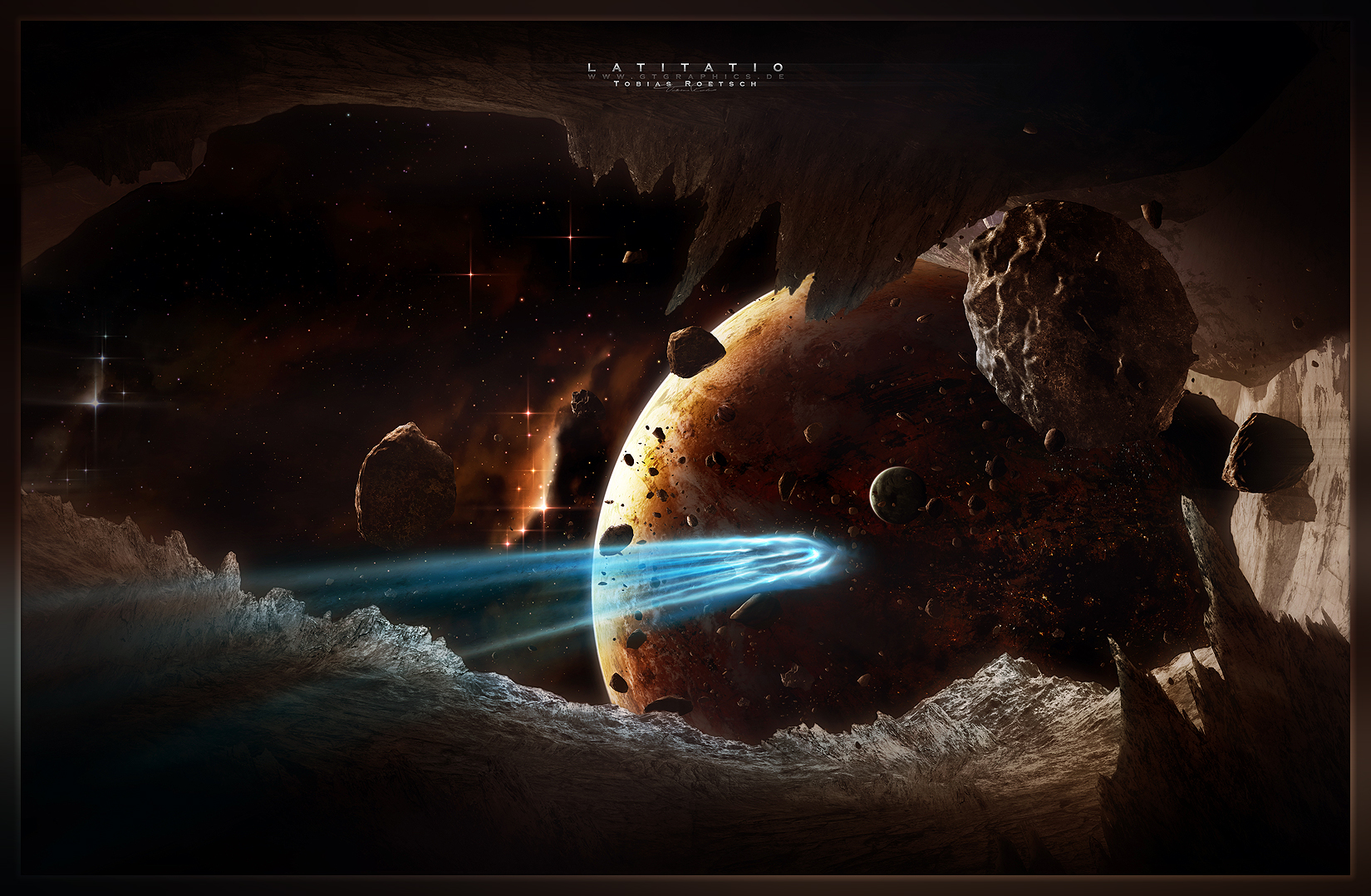
Latitatio
This image has been made for Advanced Photoshop Issue 67. I wrote a tutorial about it which has been published there. I know it's not my best, but it was a very new task for me to create a tutorial for a whole image.
You can buy the mag here and have a little preview here. I really hope it helps some of you out there.
Thanks for reading (Smile) - :-)")
This image has been made for Advanced Photoshop Issue 67. I wrote a tutorial about it which has been published there. I know it's not my best, but it was a very new task for me to create a tutorial for a whole image.
You can buy the mag here and have a little preview here. I really hope it helps some of you out there.
Thanks for reading
Image size
1650x1078px 1.35 MB
© 2010 - 2024 TobiasRoetsch
Comments164
Join the community to add your comment. Already a deviant? Log In
An adequate work, on first impression, an interesting scene. Most striking was the beauty of the starfield, and of the planetary scene as the asteroid field moves off into the background. The interest of the scene is indeed verified by the unique vision of the arrangement of scenery presented, being such as is not often seen in digital space art. Nevertheless, the work is of moderate originality – surely an appreciable feat in modern space art – in presenting a curious view from an ideally located asteroid or moon, and at the event of a comet! Otherwise, however, apart from the originality of the vision, the elements are fairly standard, which, however, is not a negative as such.
Now, although it does offer the positive attributes, namely of vision of scene, and the beautifully elegant starfield, nicely positioned frame of context, a nicely detailed asteroid field, and splendidly toned, coloured and detailed planets, it has several other detractors in the way of technique, which both equalises the quality of the overall technique, and diminishes the impact of the piece. These detractors are identifiable in the following: the lack of detail and subtlety of form in the comet effect, the smoothness of the transition of light in the foreground terrain, which lacks more particular lighting effects on its surfaces (from light sources), and perspective issues in the foreground. Although the former is self-explanatory, some detail on the latter is worth giving.
The issue of perspective, in this case, seems to be associated with the issue of lighting. Not only does light in the foreground have a fairly constant transition of lightness, in this case, on each section of the foreground, with some being more or less bright, but each having a similar gradient, but the scales and differences in brightness between each section, is not finely transitional. Thus two issues arise: a lack of a particular sense of lighting from light sources and their interaction with the scenery in the scene, and the sense of a pasting together of jigsaw puzzle pieces, by the incongruity of the lighting and scales between the sections in the foreground, such as between the closest cliffs to the bottom right, and the large cavernous walls to the right, which are again different in scale from the mountain ranges along the bottom of the piece, which suggests a lack of connection, despite little room given for a transition between the two.
The section connecting the right wall to the top of the cavern, where the largest apparent asteroid lingers, also has an uncertain sense of scale – indeed, it could even look like a planet, under certain interpretation. Although this sort of ambiguity can have an interesting artistic use, in this case, because it is a space scene which attempts to show coherent scenery, this seems to be more of a flaw in trying to form coherency in the composition of the foreground. Therefore, greater attention to transition and particular lighting, could greatly improve both the technique and impact of this piece.
Although these flaws exist in this piece as it is, it is nevertheless a fair piece, and, as said at the beginning of this critique, is a most adequate piece indeed. It performs an interesting scene with merits of detail, tone and colour, especially in the backdrop, which is augmented by the interesting vantage point of the scene setup by the foreground. Overall, a fair work, albeit with room for improvement.
I look forward to your further works and improvements, Toby.