ShopDreamUp AI ArtDreamUp
Deviation Actions
Behind the Scenes, Tips, Resources
Some exclusive behind the scenes shots, showing steps of my working process. Also stock images, and other things.
$5/month


Suggested Deviants


Suggested Collections


You Might Like…


Featured in Groups


Description
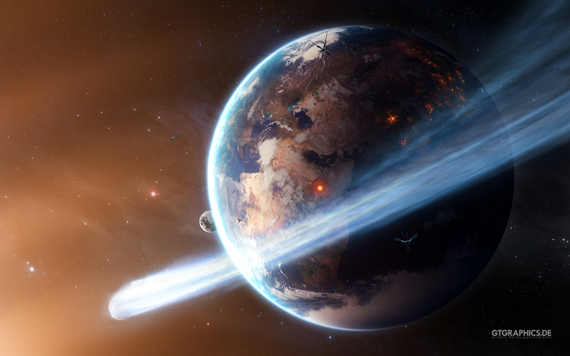
This is a remake of the first part of my little "Future Earth Series". Looking on the old image forced me to try a new version that is more up to my today's standards. The old image can be seen here:

www.gtgraphics.de
Follow us on facebook or google+
www.gtgraphics.de
Follow us on facebook or google+
© 2012 - 2024 TobiasRoetsch
Comments93
Join the community to add your comment. Already a deviant? Log In
It's allway's a pleasure viewing your work and though i love the alteration's made to the foreground artwork, i prefer the dark space background of the original piece, Tobias, because it has the much stronger look and depth of real space. Space is an unkind, dangerous and eerie looking place but this version is far too soft and gentle in its appearance. I also think that there is way too much light/glow at the left, as you would never see it that bright in actual space itself (though this is sci-fi and an artist's own visional work of imagination; which rarely portray's total/actual reality), and therefore takes away a great deal of the realism of the piece for me. Mind you! The way you have done the lighting effect is brilliant, as are the stars and satelites. I think the planet's blue's and brown's need to be a darker and stronger colour to bring it more to the forefront of the viewer's view, and thus showing a distinct distance between the foreground and the celestial background.