ShopDreamUp AI ArtDreamUp
Deviation Actions
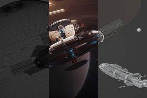
Behind the Scenes, Tips, Resources
Some exclusive behind the scenes shots, showing steps of my working process. Also stock images, and other things.
$5/month


Suggested Deviants


Suggested Collections


You Might Like…


Featured in Groups


Description
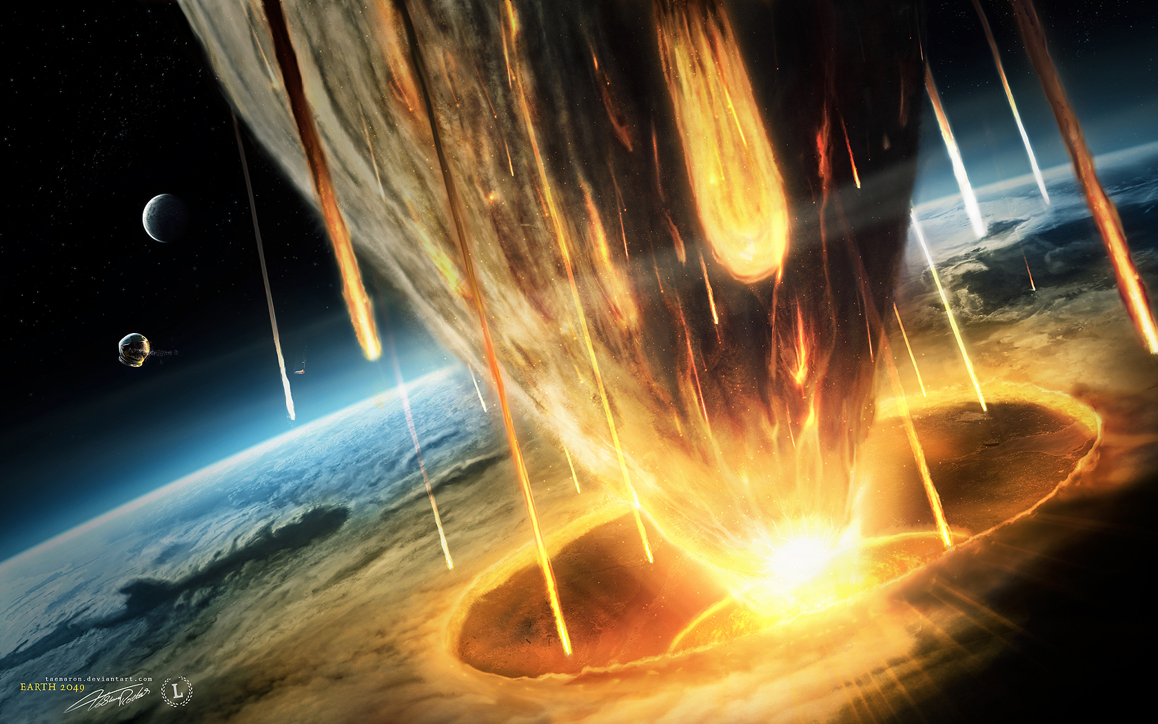
Last picture of the series. Not a new concept but I wanted to give it a new try/look. This is also my entry for the latest theluminarium artpack that can be found here
The year was chosen randomly. So if you prefer 2012 instead of 2049... try to ignore my title
1024x768
1280x1024
1440x900
1600x1200
1680x1050
1920x1200


______________________________
I am available for commissions. Feel free to contact me: t.roetsch@gtgraphics.de
HOMEPAGE
Social Networks
Print & Merchandise Shops
© 2009 - 2024 TobiasRoetsch
Comments739
Join the community to add your comment. Already a deviant? Log In
This looks so cool!!