ShopDreamUp AI ArtDreamUp

Deviation Actions
Behind the Scenes, Tips, Resources
Some exclusive behind the scenes shots, showing steps of my working process. Also stock images, and other things.
$5/month


Suggested Deviants


Suggested Collections


You Might Like…


Featured in Groups


Description
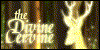
Inspired from my trip to Saxon Switzerland I came up with this wallpaper. The arch was quite not working as originally intended and that is why I had to change it several times. A bit different topic this time, no sci-fi or space. I hope you like it anyway!
Different wallpaper can be downloaded here.
Homepage: www.gtgraphics.de
Follow us on facebook or google+
Different wallpaper can be downloaded here.
Homepage: www.gtgraphics.de
Follow us on facebook or google+
Image size
1600x900px 1.06 MB
© 2013 - 2024 TobiasRoetsch
Comments33
Join the community to add your comment. Already a deviant? Log In
The lighting works wonderfully for the piece with everything physically correct as far as where the light hits based on the sun's angle and object blocking. The brightest point on the screen (where my eye is drawn) is to the other distant arch, like its common place in this land. It gives the whole scene a warm and what I would describe as a mystical feel. The rocks on the left part of the arch seem a little bright (space above the deer's back) considering how bright the rocks on the opposite wall are. Consider the direction of the sun's light. One side can't be receiving direct sunlight and the other side glowing unless there is some SERIOUS reflected light. The contrast with a shadow over the rocks where the deer is and the brightly lit other side might add some extra depth to the solo character in the scene. Speculation. Consideration. <img src="e.deviantart.net/emoticons/b/b…" width="15" height="15" alt="
My only issue is the deer. It seems like it was done in a different style, a very blocky and CGI appearance, lacking the texture detail of its surroundings which is a little jarring considering it's the closest focus in the picture. Look at those rocks its standing on. Very textured and shaded with a glossy appearance. From it's fur to the antlers, its detail lacks consistency with the awesome backdrop. I don't know if it's intentional, like you are trying to look past the simplicity of the deer (a contrast object), but it stands out for better or worse. But again, all speculation.
Overall, it's a wonderful image. I don't know what level you want someone to nitpick but I feel like it has the impact you were probably going for. Let me know if you want more detail or other image critiques.